4 June 2023
Hammerhead has carved out their name in the cycling GPS world by continually updating their products with new features, and an evolving user interface. For the most part, it’s focused on new features. But every once in a while Hammerhead will refresh the user interface – and generally speaking it’s been very good. It feels polished and modern, albeit a bit slower these days as the Karoo 2 ages. But on the whole, people are very happy with the Karoo 2 (and rightfully so – I often use it).
And then yesterday happened.
Hammerhead released a new user interface refresh for the data pages specifically. The main pre-ride/post-ride menus and such has remained the same, but the new data page fields (that’s the thing you look at while riding) have changed to being a relatively minimalist layout to one that’s a but more…boxy.
And with that change, a very many people were very upset about it. Last count on the Hammerhead Karoo 2 forums (a place that arguably very few Karoo 2 users actually know exists), it’s approximately 100% against, 0% in-favor. There was one or two comments that was wishy-washy maybe in favor, but it’s plausible they may have had a few beers beforehand. Rather hard to know.
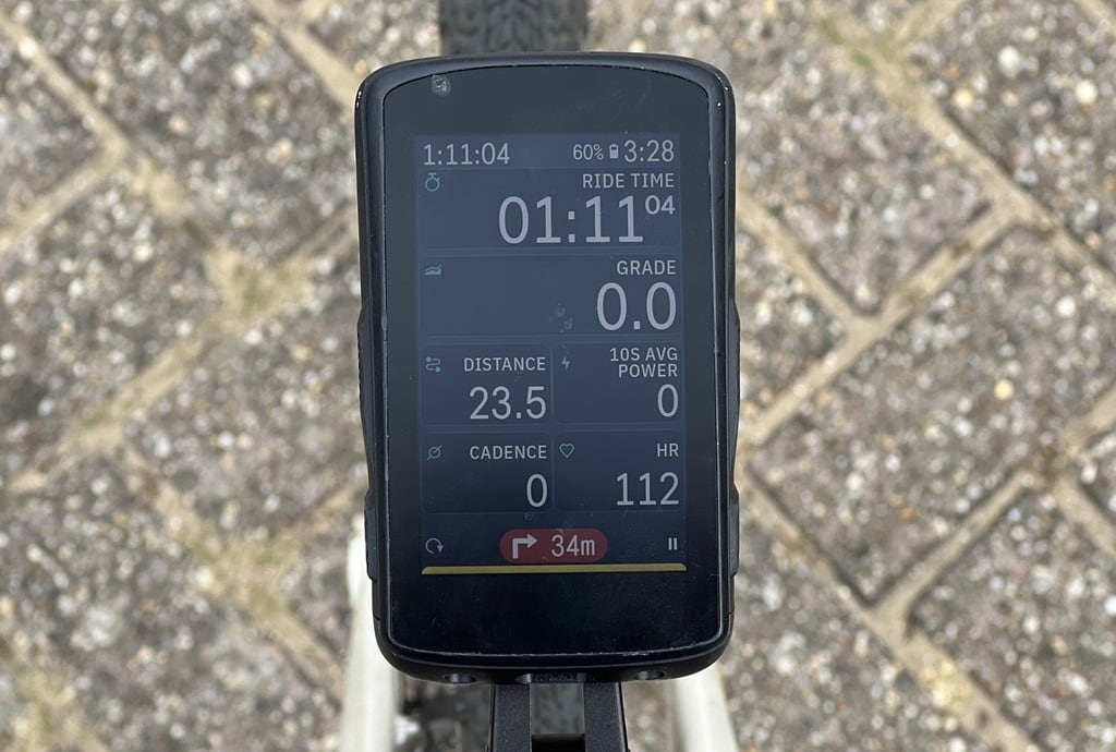
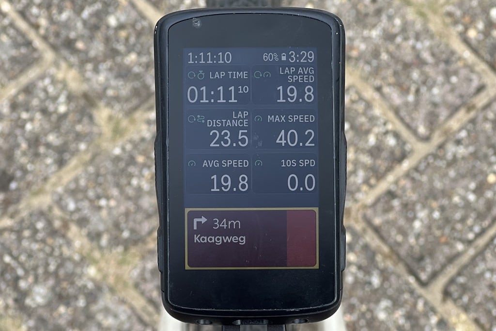
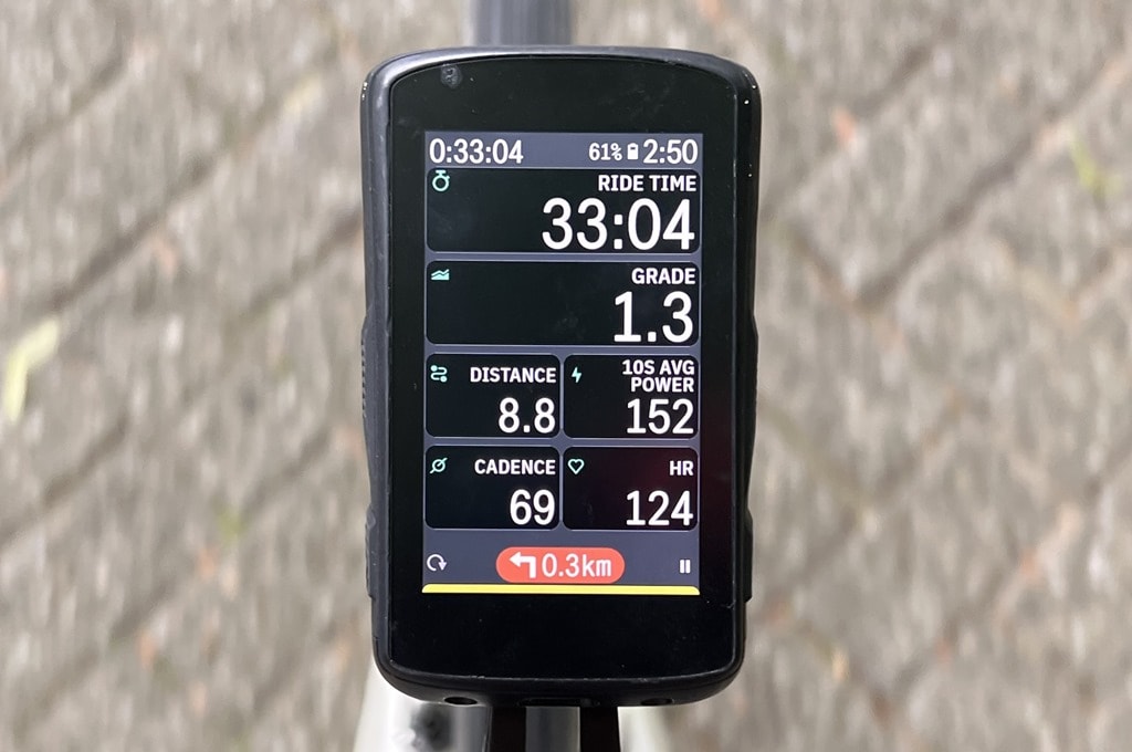
So, being one to want to actually try it out before slaughtering something, I went out for a couple-hour gravel ride with it yesterday. I had pre-loaded a route, and then had all my usual data fields setup. Here’s the new setup:
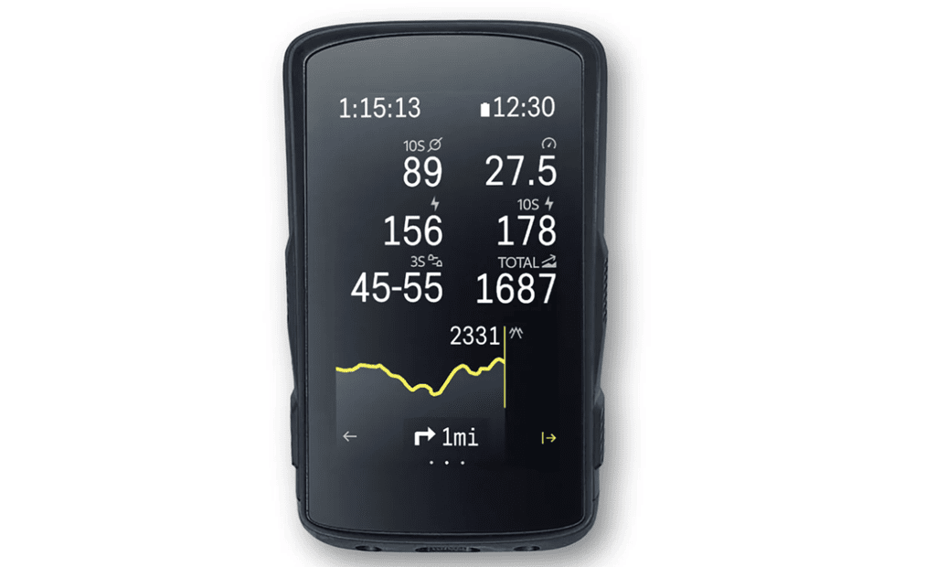
For comparison, here’s the old UI. It’s funny, I have a gazillion photos of the Karoo 2 with the CLIMBER feature enabled, or the Shimano Di2 plug-in enabled, but finding an older but not too old photo of just the generic data pages was downright impossible. So, here’s their stock photo:
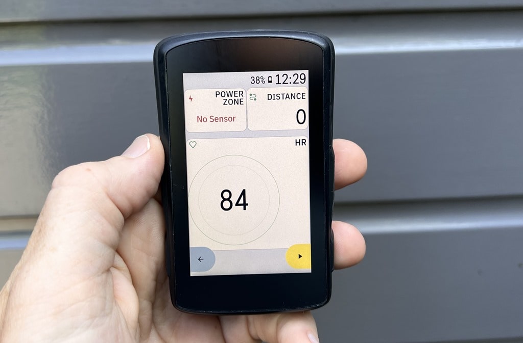
As you can see, the new user interface adds a bunch of boxes around everything. Whereas the old user interface was more flat and minimalized.
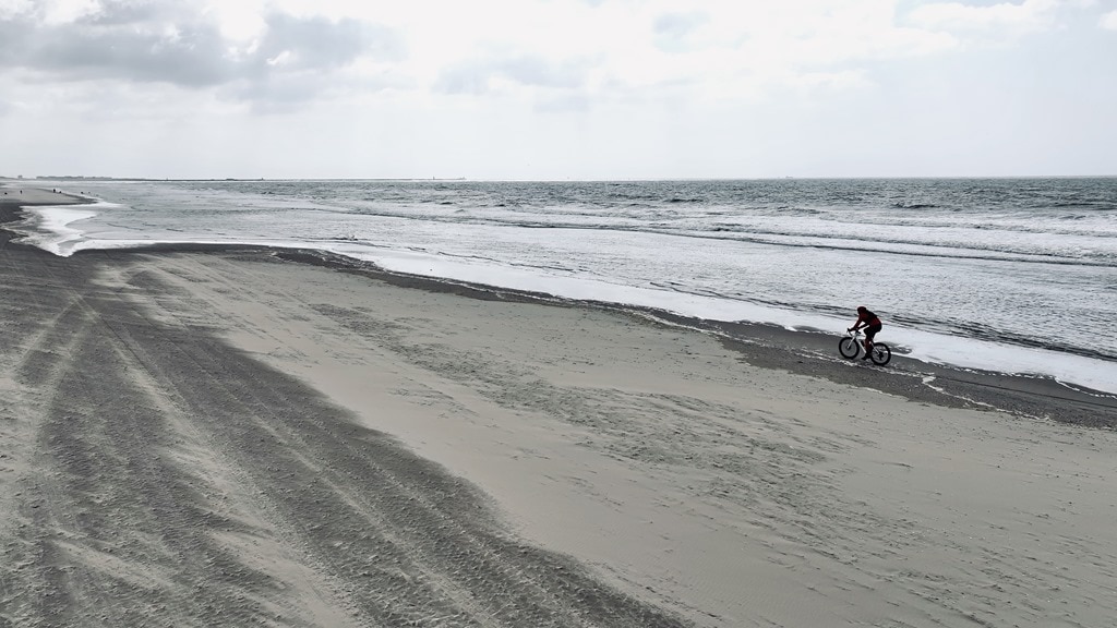
And here’s the thing, during my two hours riding – the new user interface was not my biggest problem. My actual biggest problem was not checking the tides before doing a beach ride, and then finding out it was precisely (to the minute) high-tide. Meaning it was a soft-sand slog.
However, even then, the new user interface actually didn’t bother me that much. But, there’s I think one important difference: I have mine set for ‘dark’ mode. In other words, white text on black background, as you can see. Also, in the above photos, taken with less brightness, – the middle sections kinda disappear. Whereas in the photos after this, I cranked up the brightness level, and this dead-grey spaces become more obvious.
In that realm, the boxes aren’t quite so in-your-face. Whereas most of the complaints seem to be centered on the ‘light’ mode, where it’s black text on a black background, as such.
For that, I did a trainer ride today. But here’s a prettier outside picture with the light mode on, to make them more similar:
And in that lighter mode, yeah, honestly, it looks hideously dated. Why is there all that empty grey space?
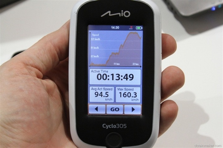
A few people mentioned it reminding them of Bryton. But I’d go even further and say it reminds me of Mio bike computers from at least a decade ago. Here’s that for reference (from a post in August 2012):
Do I think there are worse offences? Sure, I suppose. I mean, they could have removed ANT+ or something.
But yeah, the ‘light’ mode user interface is not at all my favorite. Either way I had no real issues using the dark-mode UI during my ride, it worked perfectly fine and didn’t bother me one way or the other.
Hammerhead has responded to the criticism in a comment on their forum, saying:
Hi everyone,
Thanks for providing your feedback on the new look of the data-fields.
While these may not be solving all the problems, but we assure you that we are moving in a direction that we believe would make our product stronger and better for our riders in the long term. The changes are fundamental to significant improvements coming down the line.
We understand that some of the real concerns are around shrinking of the data values and contrast of the background.
We have heard your feedback and are investigating how to make some of this adjustable. Thanks again!!
Meanwhile, in kinda unrelated news – Hammerhead has significantly discounted their Karoo 2 units, down 35% to $259 (normally $399)– the lowest price it’s ever been (by a ton). Obviously, they didn’t exactly aim to have their news coverage of their sale come by way of an internet revolt about their user interface. As for whether or not a Karoo 3 is in the works? Who knows. Certainly I think Hammerhead/SRAM is overdue for one – but they’re fast approaching the cutoff for when it makes sense to launch a new bike computer (ideally June or earlier), else you miss the summer season. Certainly there’s many years of past bike computers being launched mid-summer or later summer, but the general trend is towards the May/early-June timeframe.
In any case, I still think the Karoo 2 is a fantastic unit – and especially so at $259USD. I’m sure Hammerhead will sort things out, since they do tend to be known for listening to customer feedback. Till then, I’ll just keep on keepin’ on with dark mode.
With that – thanks for reading!
Found This Post Useful? Support The Site!
At the end of the day, I’m an athlete just like you looking for the most detail possible on a new purchase. These posts generally take a lot of time to put together, so if you’re shopping for the Hammerhead Karoo 2 or any other accessory items, please consider using the affiliate links below! As an Amazon Associate I earn from qualifying purchases. It doesn’t cost you anything extra, but your purchases help support this website a lot. Even more, if you use Backcountry.com or Competitive Cyclist with coupon code DCRAINMAKER, first time users save 15% on applicable products!
And of course – you can always sign-up to be a DCR Supporter! That gets you an ad-free DCR, access to the DCR Quarantine Corner video series packed with behind the scenes tidbits…and it also makes you awesome. And being awesome is what it’s all about!